BRANDING
Carnaval de Québec
Carnaval De Québec is an annual festival that celebrates Québec City’s winter and its rooted traditions. The festival is known for its Canadian based sports and activities that invites families and friends from all over the globe.
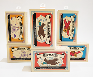
Mis-Match is a sock brand that focuses on matching unconventional items together to create new ideas and spark imagination. The packaging is influenced by vintage match box design, however, contains two pairs of socks. Mis-Match incorporates both ideas of match boxes and mis matched pairs of socks, resulting in a creative brand.
Mis-Match is a sock brand that focuses on matching unconventional items together to create new ideas and spark imagination. The packaging is influenced by vintage match box design, however, contains two pairs of socks. Mis-Match incorporates both ideas of match boxes and mis matched pairs of socks, resulting in a creative brand.
Mis-Match is a sock brand that focuses on matching unconventional items together to create new ideas and spark imagination.
The packaging is influenced by vintage match box design, however, contains two pairs of socks. Mis-Match incorporates both ideas of match boxes and mis matched pairs of socks, resulting in a creative brand.
↓
CONCEPT
What It's All About
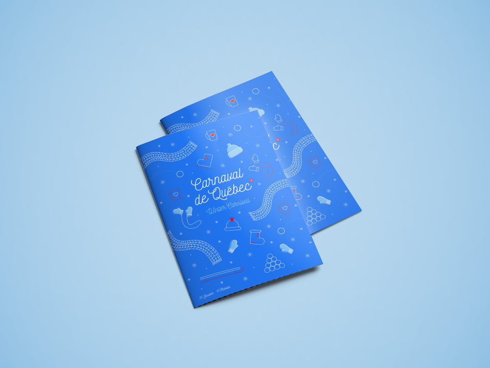
The Carvnaval de Québec is the largest winter festival in the world. They are known for their many winter activites from bobsleding, canoing, ice sculptures, skating and much more. Although native to Québec, the carnaval invites guests from all over the world to take part in their festivites. I wanted to capture the welcoming spirit of the festival and illustrate its hospitality and family friendly nature in a playful manner.
My professor challenged me to merge match boxes and socks as a package idea. Often people mix up their socks and cannot find the other pair. Mis-Match embraces this idea and encourages mis-matching socks as well as helps consumers organize their drawers. This is to better aid them in finding a certain pair of socks when they need it, serving as a functional package in the home. This design focuses on using playful illustrations and bright colours to attract a range of different consumers such as; children, people with a love of vintage design and socks enthusiasts.
The intial idea of merging match boxes and socks came from
a random suggestion that became a challenge. Often people mix up their socks and cannot find the other pair. Mis-Match embraces this idea and encourages mis-matching socks as well as helps consumers organize their drawers. This is to better aid them in finding a certain pair of socks when they need it, serving as a functional package in the home. This design focuses on using playful illustrations and bright colours to attract a range of different consumers such as; children, people with a love of vintage designand socks enthuses.
The intial idea of merging match boxes and socks came from a random suggestion that became a challenge. Often people mix up their socks and cannot find the other pair. Mis-Match embraces this idea and encourages mis-matching socks as well as helps consumers organize their drawers. This is to better aid them in finding a certain pair of socks when they need it, serving as a functional package in the home. This design focuses on using playful illustrations and bright colours to attract a rangeof different consumers such as; children, people with a love of vintage designand socks enthuses.
SOLUTIONS
Making It Better
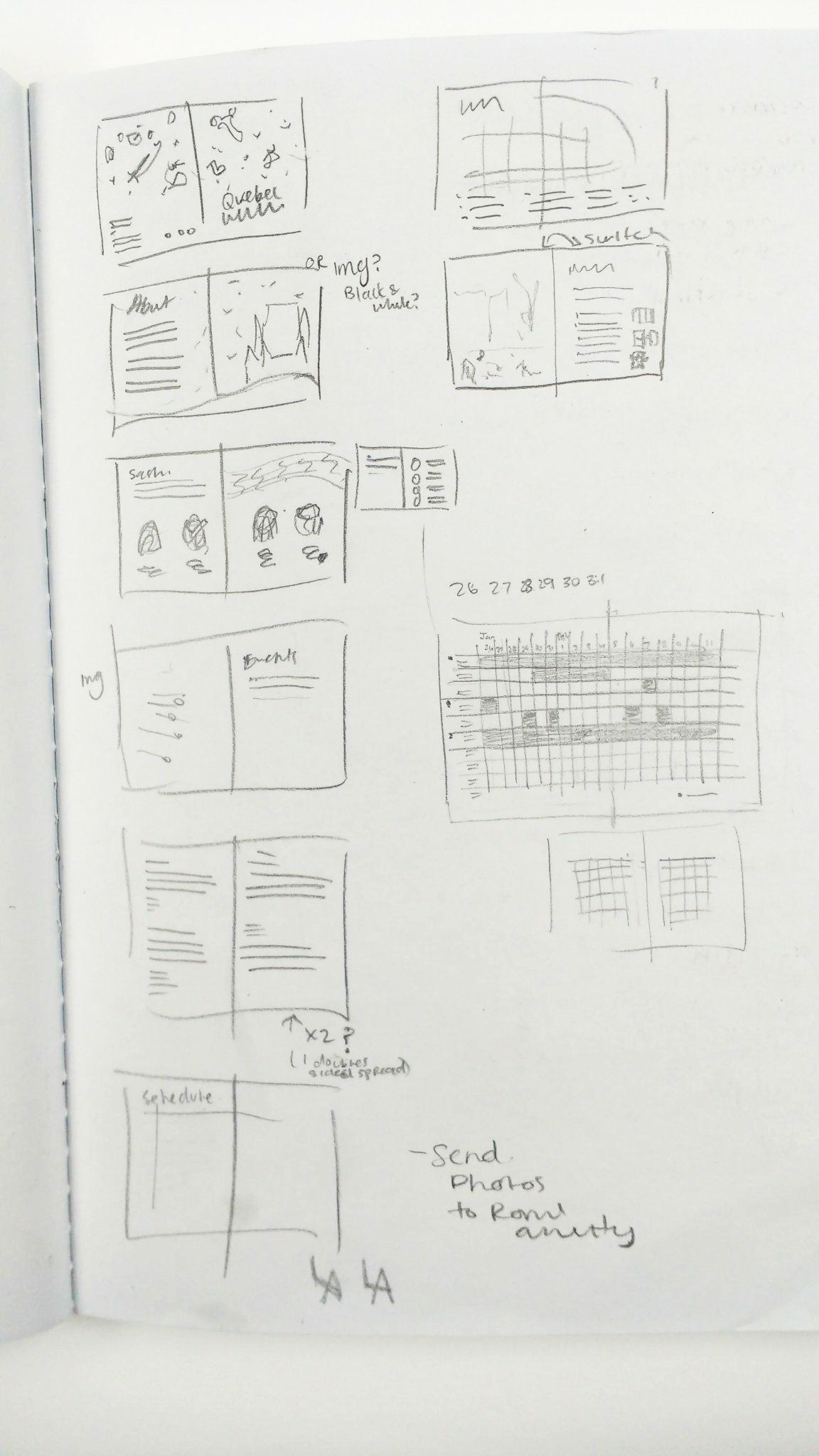
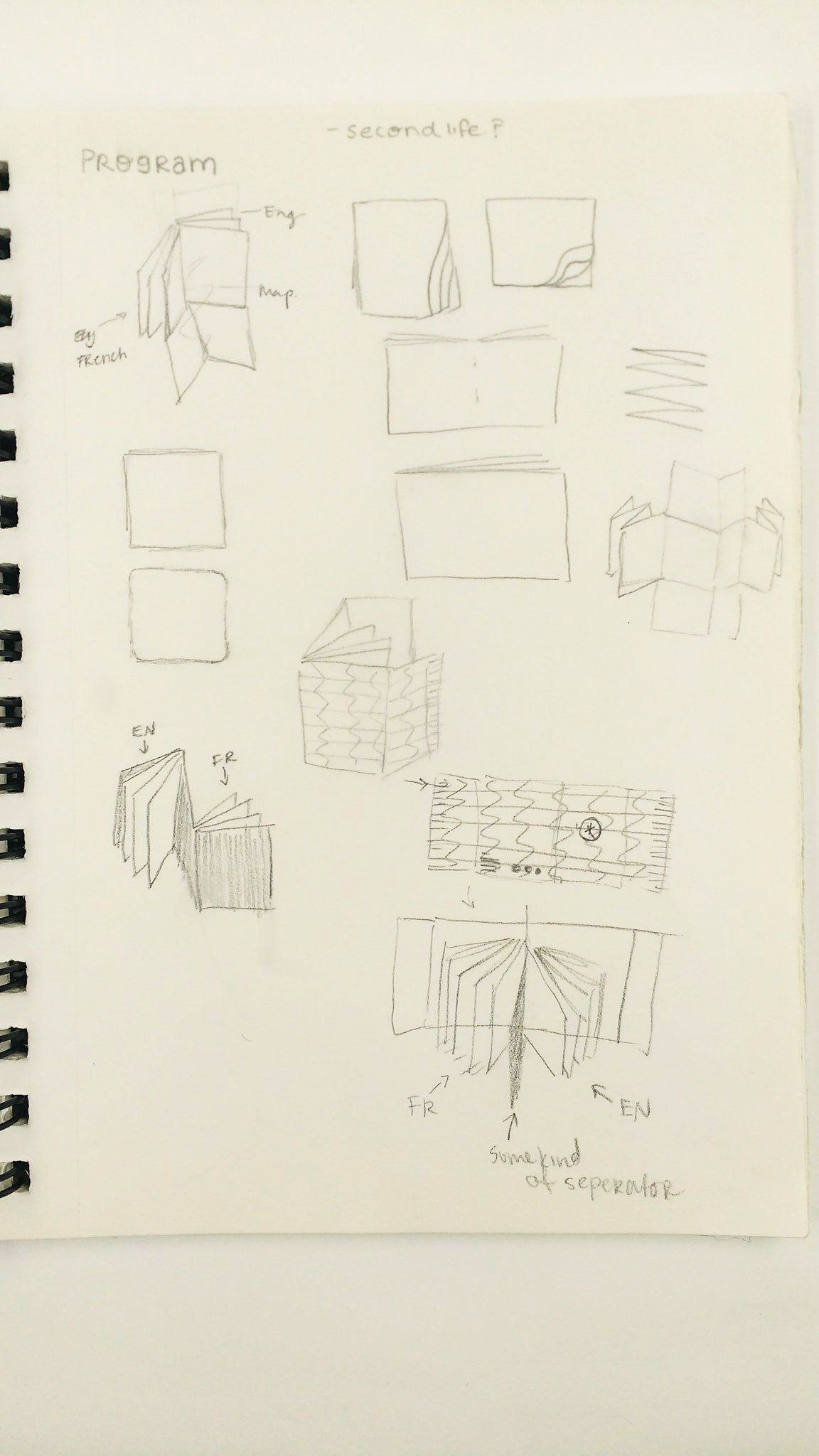
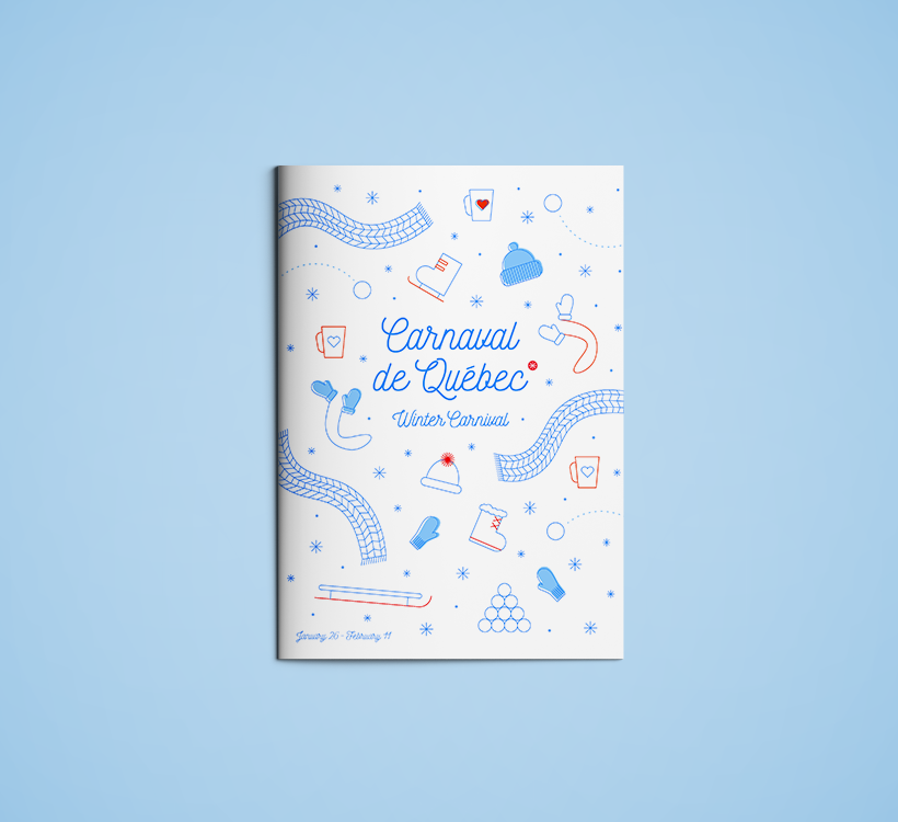
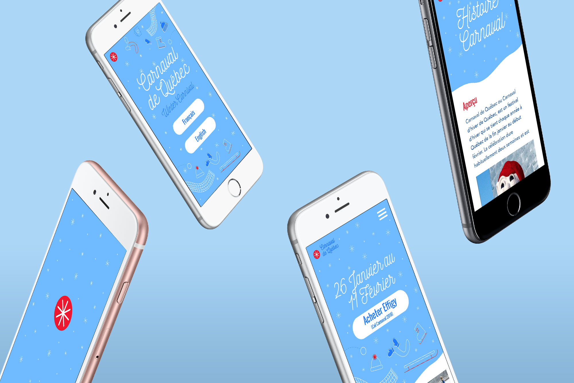
The Carnaval is located in Québec, a French speaking province, where it invites both locals and tourists to part take in activites. Although they encourage people outside of Québec to visit, most of their content on their site and program books are not well organized and do not provide english speakers clear information. To adress this issue, I wanted to have french and english content that is easily accessible and identifiable in all contexts through a redesign.
The intial idea of merging match boxes and socks came from a random suggestion that became a challenge. Often people mix up their socks and cannot find the other pair. Mis-Match embraces this idea and encourages mis-matching socks as well as helps consumers organize their drawers. This is to better aid them in finding a certain pair of socks when they need it, serving as a functional package in the home. This design focuses on using playful illustrations and bright colours to attract a range of different consumers such as; children, people with a love of vintage design and socks enthuses.
DESIGN CHOICES
A Welcoming Redesign
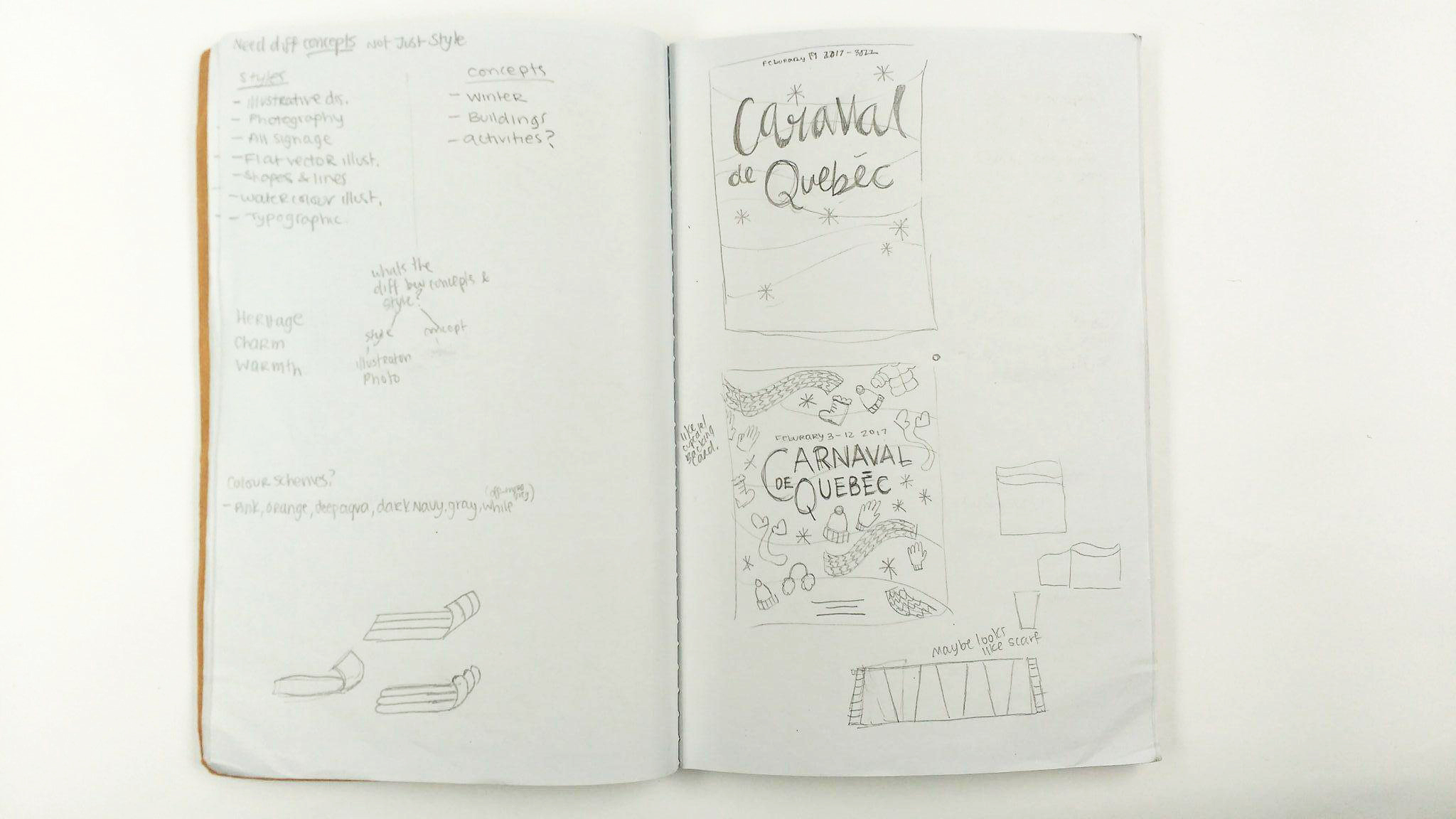
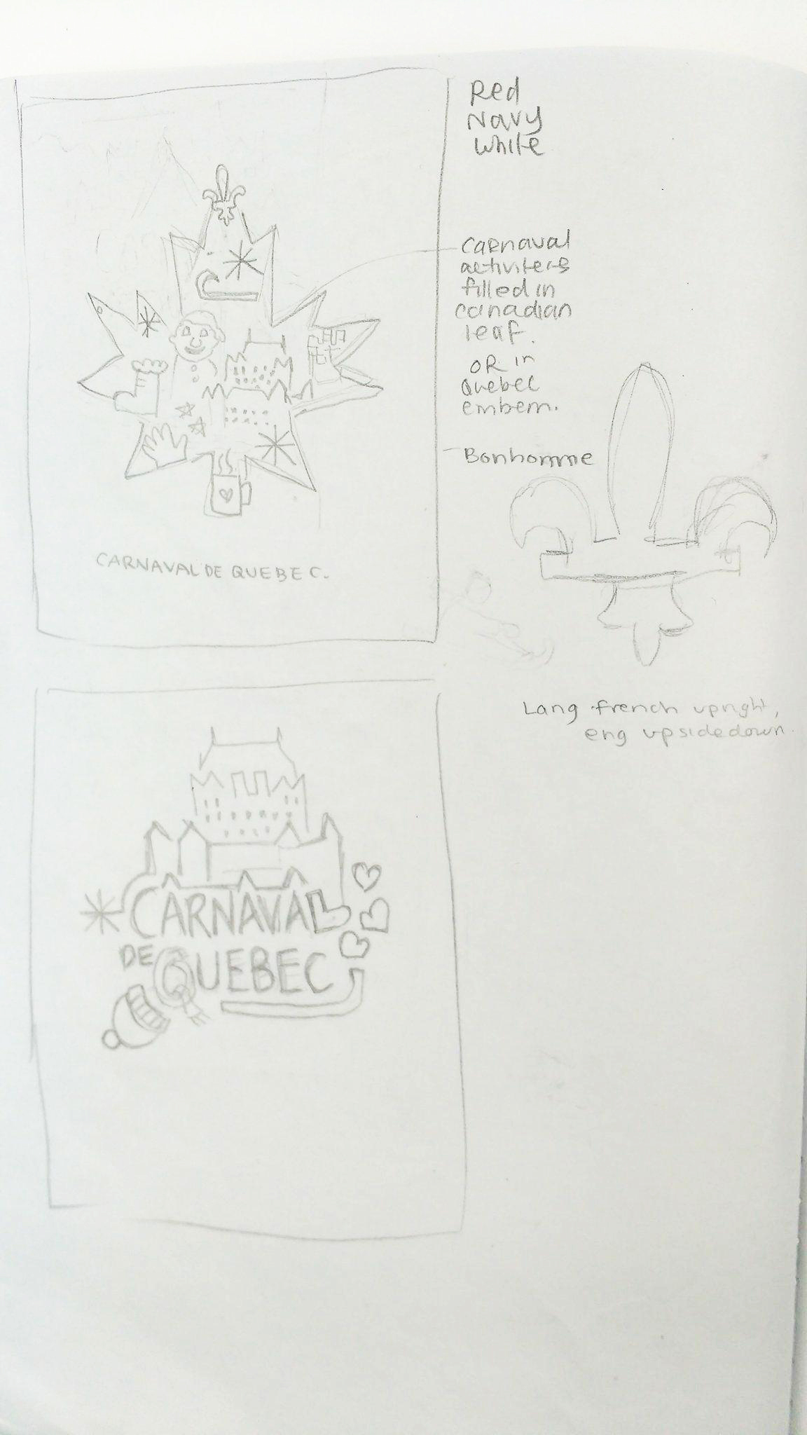
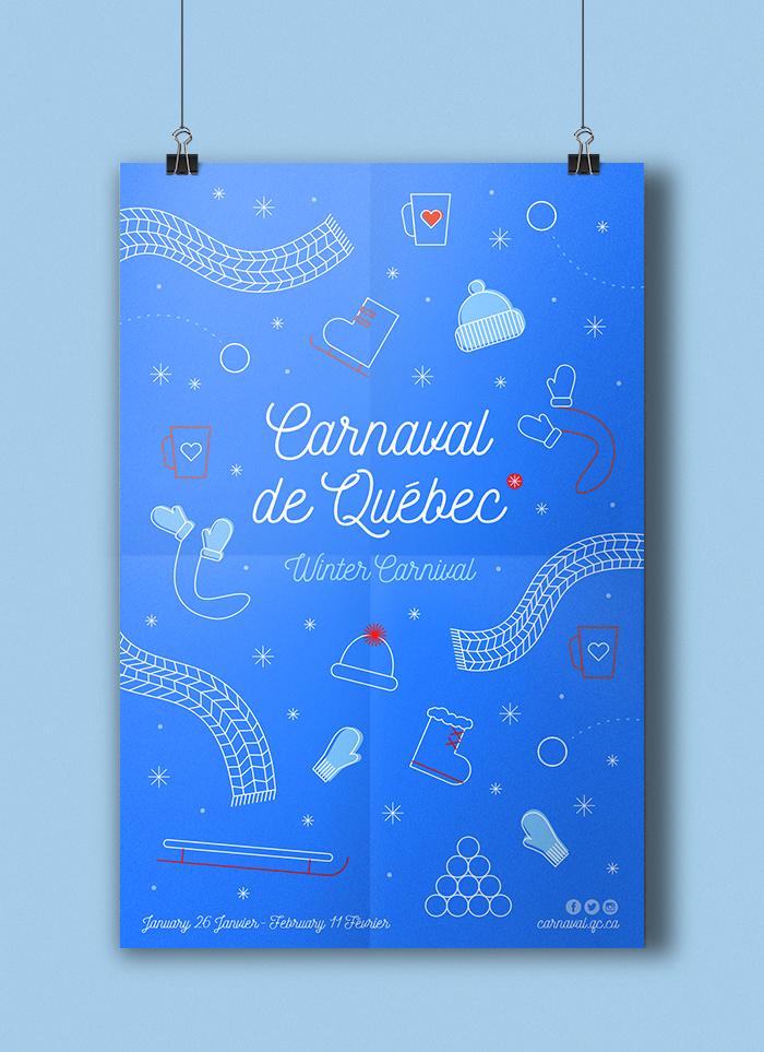
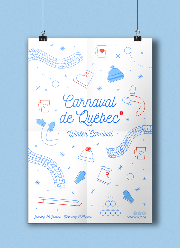
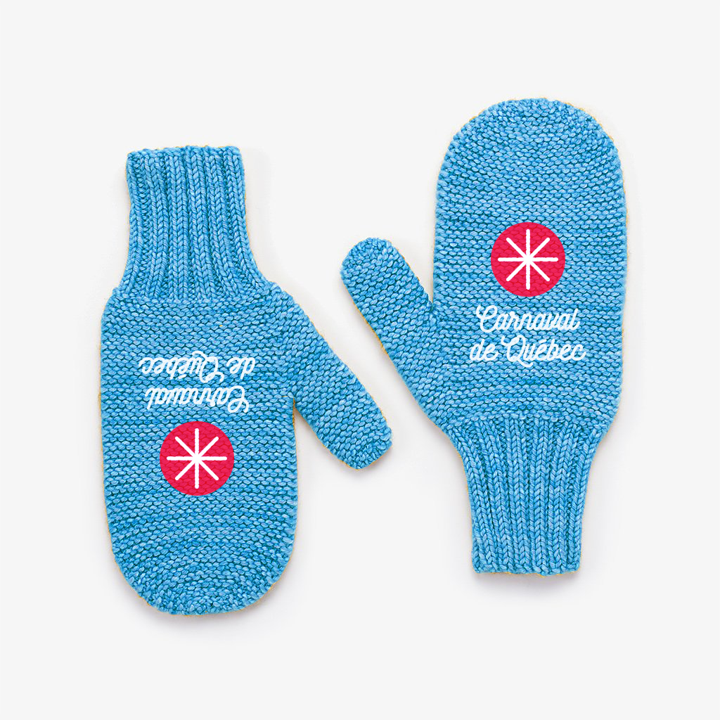
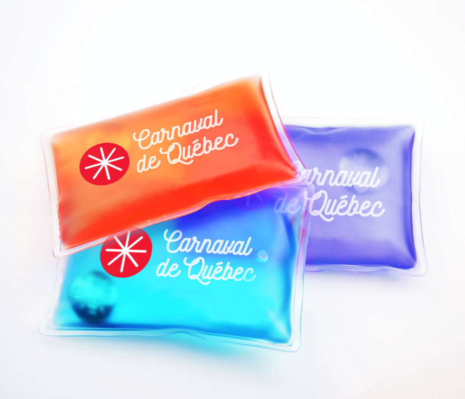
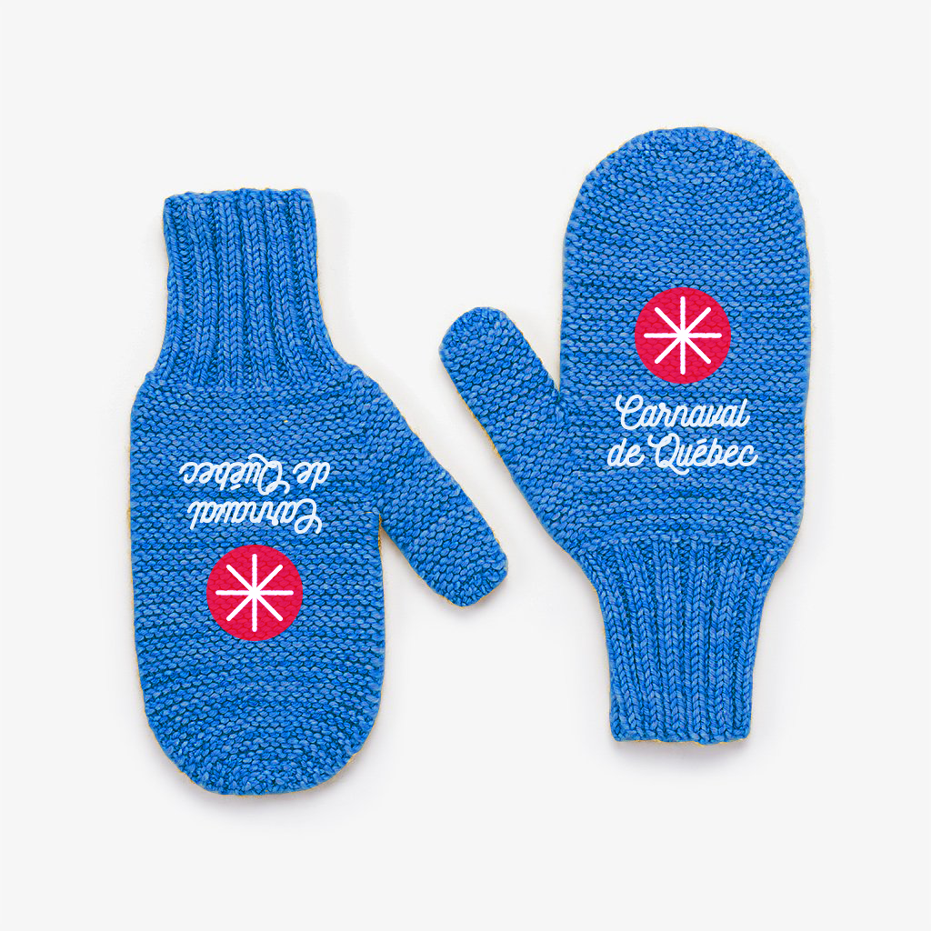
I used the colours red, blue and white which the festival is know for and brightened the heck out of them. The new colours add a vibrate look and capture the excitement the Carnaval is all about. A snowflake was used to represent the Carnaval, as snow is affiliated with winter and the various activites that take place in it during Carnaval de Québec. Other illustrations of winter wear and activites are used as the main look for the rebrand. The illustrations can be used in different mediums and inversed for more utility on different applications.
The look of Mis-Match came from an evolution of designs that were refined and worked to be a fun and playful look. The idea behind the illustrations was to creates somewhat impossible scenarios as an animal series. From a Dog flying, to a fish riding a bike, we want to spark kids imaginiations and entertain impossibly possible ideas. Type treatment and the overall look was to mimic the feel of a vintage matchbox. The playful illustrations and interesting look is sure to appeal to both a young and older audience.
There was a huge amount of trial and error to come to the final package design for Mis-Match.
I tried many different styles from a regular box, match box, hanging containers, wood, paper, card board and so on. Even with the final design, I went from minimal design to illustrative in the end. With all this test a trial, I was able to come to the best results.


PROCESS
Creating The Perfect Look
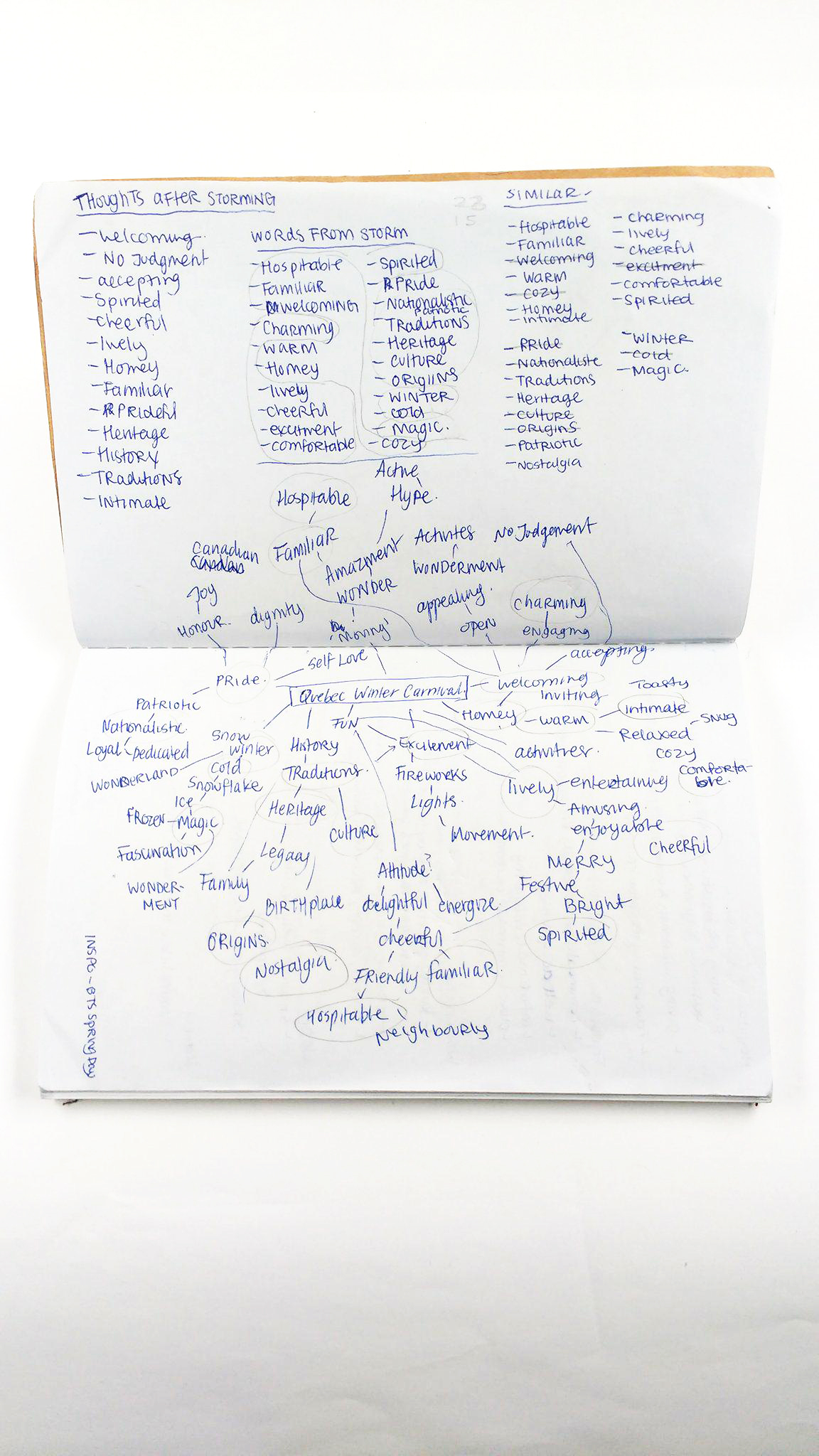
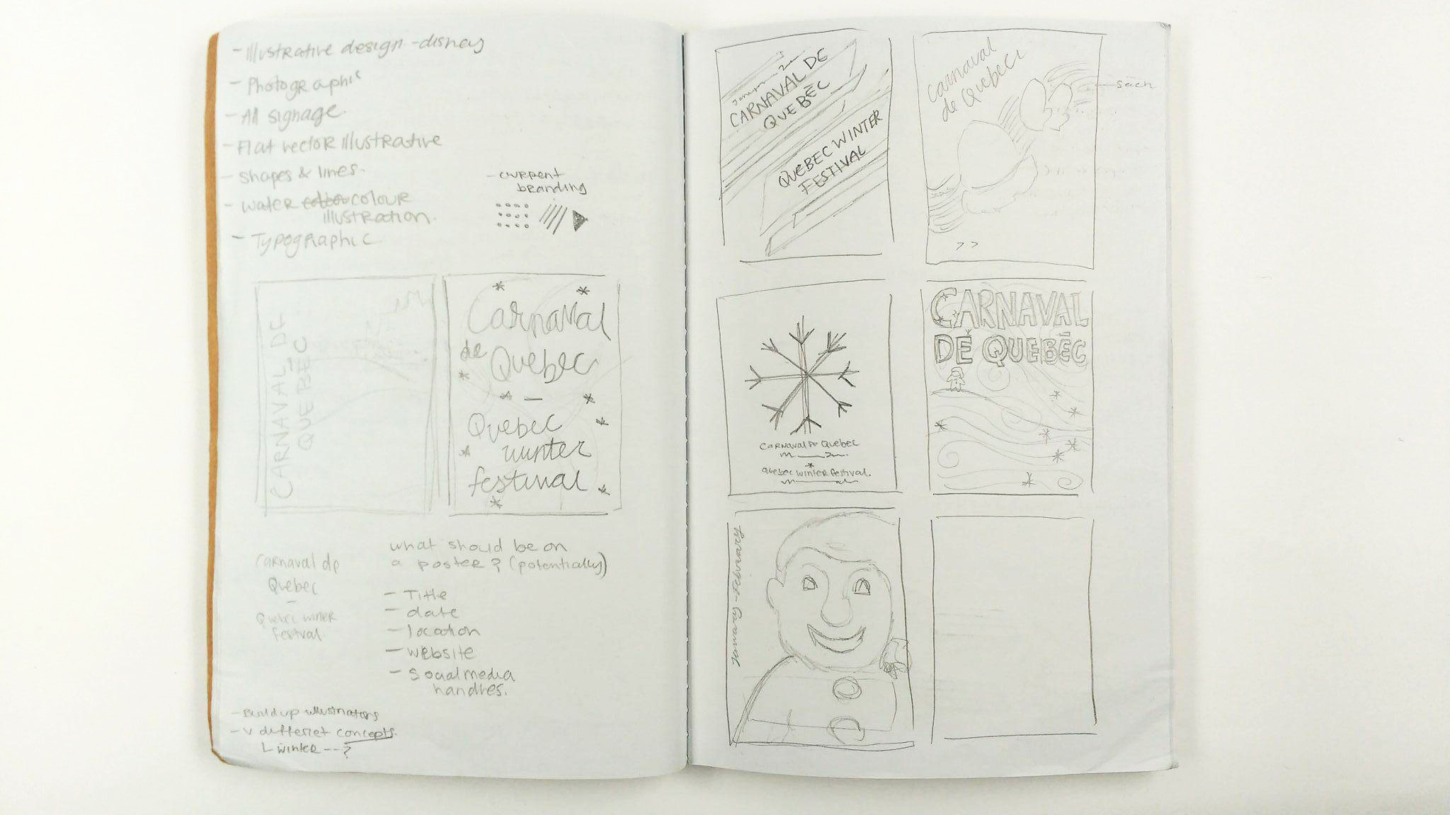
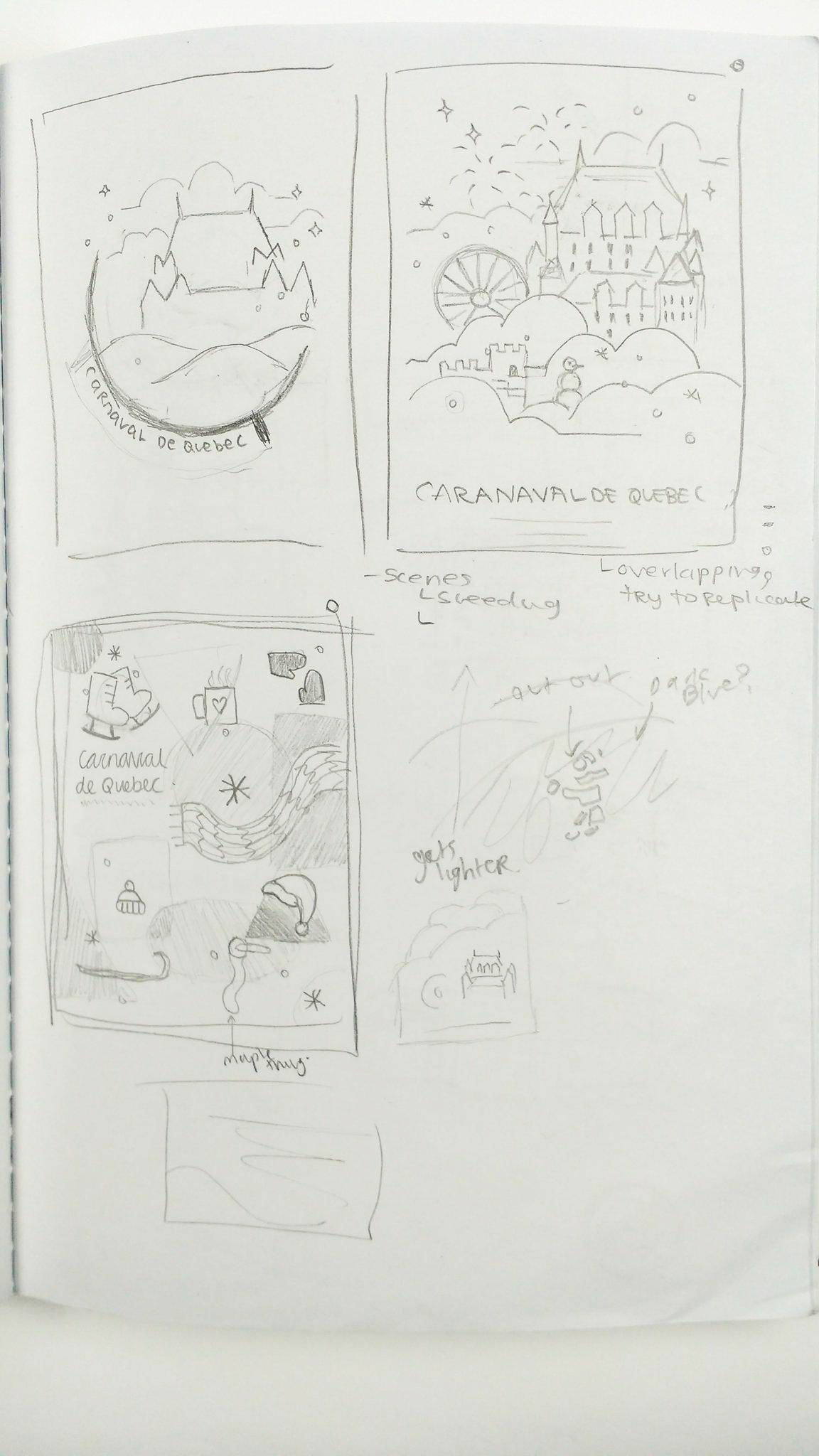
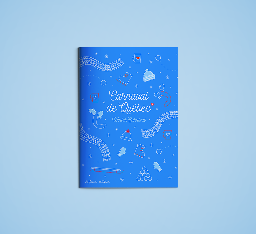
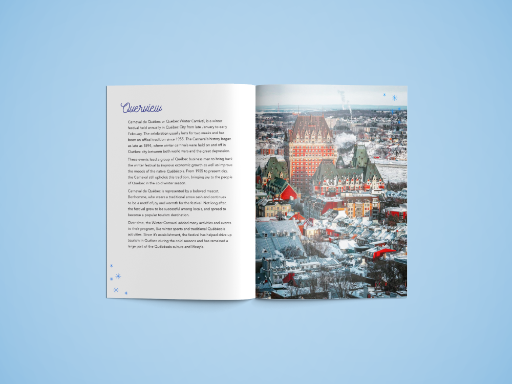
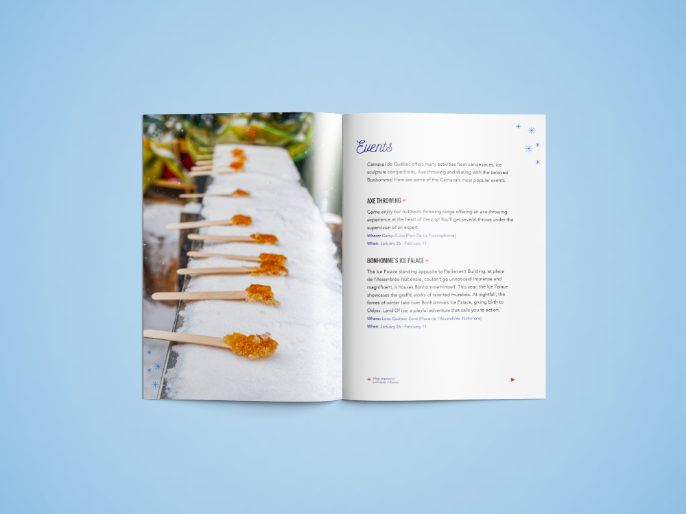
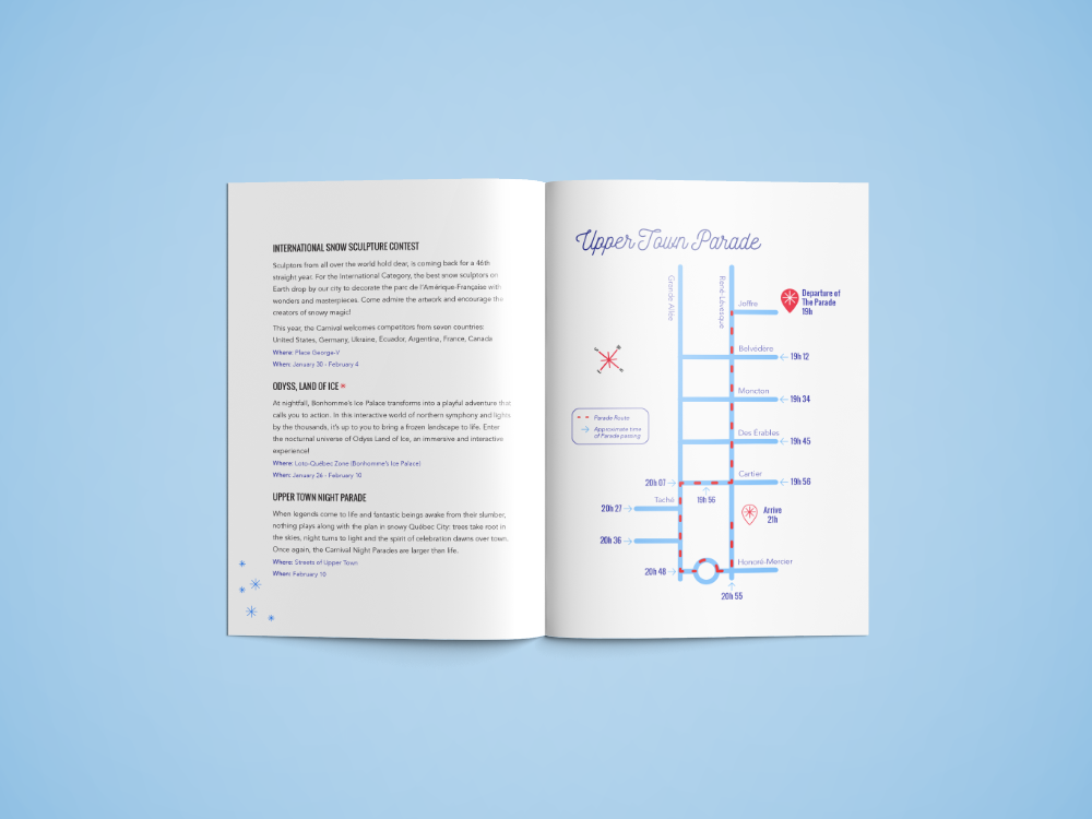
There was a great deal of process that went into creating posters, mobile and a program book for the festival. Research was put into understanding the feel of the festival and capturing those feelings into a desgin that best defined the carnaval.
There was a huge amount of trial and error to come to the final package design for Mis-Match. I tried many different styles from
a regular box, match box, hanging containers, wood, paper, card board and so on. Even with the final design, I went from minimal design to illustrative in the end. With all this test a trial, I was able
to come to the best results.
when life gives you
lemons, make lemonade
and brand it.
when life gives
you lemons, make lemonade and brand it.
FINAL PRODUCT
New Look, Same Feelings
The new design is playful and inviting, as the current Québec Carnaval is. This Rebrand was quite fun and challenging to take on. After completeing this project, I have a new found interest in branding and hope to learn more about how to create a better design system for brands. There is room for improvement in this project in making more thoughtful design decisions to create a stronger brand. I hope to address these concerns if I ever tackle this project on again in the future.
There was a huge amount of trial and error to come to the final package design for Mis-Match. I tried many different styles from a regular box, match box, hanging containers, wood, paper, card board and so on. Even with the final design, I went from minimal design to illustrative in the end. With all this test a trial, I was able to come to the best results.
There was a huge amount of trial and error to come to the final package design forMis-Match. I tried many different styles from a regular box, match box, hanging containers, wood, paper, card board and so on. Even with the final design, I went from minimal design to illustrative in the end. With all this test a trial, I was able to come to the best results.


Let's make something cool together!
Connect with me ⟶ r.melosha@gmail.com
